What makes a design effective? Well, the only clear answer you can get is from Gestalt psychology. Also known as gestaltism, philosophy claims that the human mind will perceive an entire composition reasonably different from what it actually is compared to its individual elements.
Generally speaking, Gestalt principles assist you in understanding how you should process visual information either by starting with the whole and working your way to the parts or breaking a whole into simple component parts.
Above all, you can break down Gestalt psychology, and in this article, we will show you the nine ways you can design using the Gestalt principles.
9 Ways to design by using Gestalt’s principles
1. Gestalt law of simplicity
According to Gestalt’s first design principle, also referred to as emergence, people will interpret and perceive complex images in the simplest form they can. For example, images that give you an initial perspective but are actually different are part of this design principle. If you look at an image that will depend on perspective, you’ll perceive what your mind perceives in the simplest form. Here’s an example below.
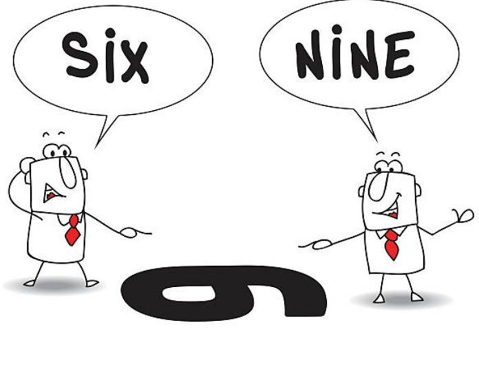
In the image, the person on the right will see the number nine, but the person on the left will see the number six. So whichever side you are on, that’s what you’ll see.
Note: You can check out these stunning report template designs here.
2. Similarity
It’s in our nature to group things that look alike together. In one of Gestalt’s principles, similar elements will visually be grouped together. Similarity can also be used to connect elements together that might not be next to each other in the design.
Of course, if you want things to stand out, you can make them dissimilar from the rest. For example, the call to action (CTA) buttons are usually designed in a different color than the rest of the page to stand out from the rest and draw visitors’ attention. Companies who care about this pay attention to the Gestalt grouping principles.
For example, in UX design, using similarity clarifies which items need to stand out. The similarity principle makes it easier to scan through a features list that uses repetitive design elements. Changing the design elements for your features and making them stand out will change the visitor’s perspective.
The principle of similarity is responsible for showing you how visitors will perceive the structure of your website.
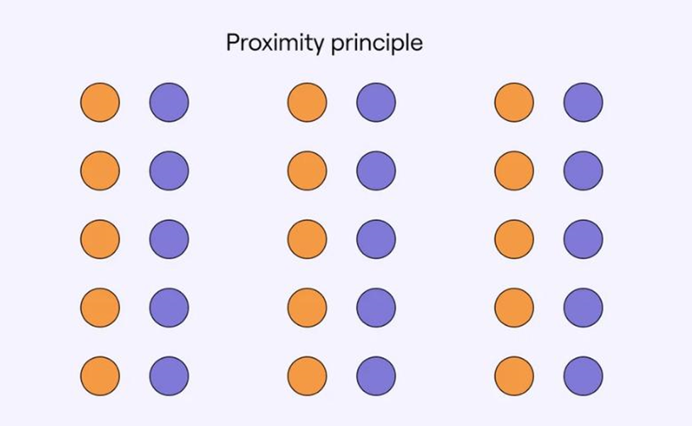
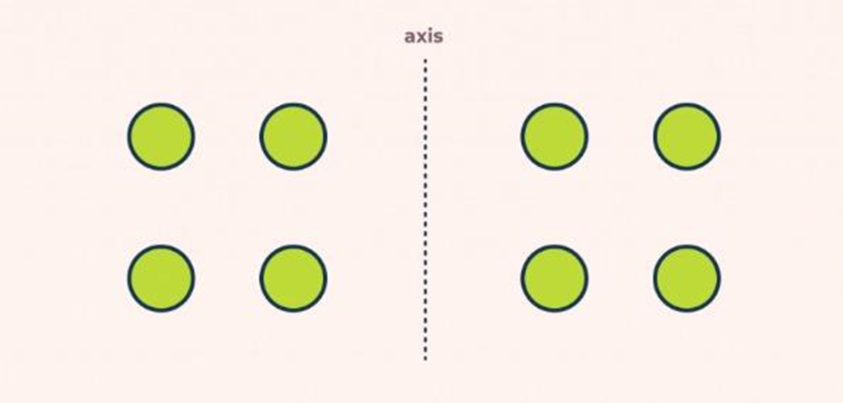
3. Proximity
Proximity is commonly used for grouping design elements. Overall, objects closer together are perceived as more related to each other than objects far apart, so we will, most of the time, perceive objects closer to each other as a whole.
Their function is even more powerful than other objects when it comes to overlapping objects. For example, in the image below, you’ll see that our brain will consider overlapping to have a stronger correlation than objects closer to each other.
4. Closure
One of the most interesting Gestalt principles is closure. Closure represents the idea that your brain will fill in all the missing parts of an image or design it sees and create it as a whole picture.
The closure principle allows your eyes to follow some hints like dotted lines until the end. However, complex images will often be seen as logo designs with negative space to balance off the details. For instance, here is a picture of an Elephant. Below, you’ll see that some elements of the picture are missing, but your brain will tend to perceive the image as a whole.
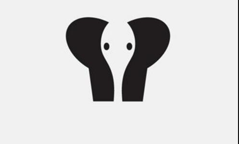
Closure is commonly used in logo designs, with some examples including NBC, Adobe, and more. Some companies also use logo animation for more creativity in branding.
Another excellent example of closure in UX and UI design is whenever you show a partial image fading off from the user’s screen to show them there’s more to see by sweeping left and right. However, if you offer a full image right away, the brain won’t immediately know that there’s more to be seen, and the user is less likely to swipe to the right or left.
5. Symmetry principle
Symmetry shows everyone’s perception of how they see all symmetrical elements within an image as one. Regardless of how far apart each element is from the other, your brain will see them as a group and try to process them in a complex scenario.
Whenever you use symmetry for web design, it matters for many reasons. Whenever someone browses through your site, they want to have a well-structured outline when scrolling through your site, or it’ll leave people confused and make them leave your site. With the symmetry principle, you can give your users a good experience when it comes to usability.
Symmetry is also popular for extracting people to special features on your site, such as the call-to-action (CTA), and another important element on your site.
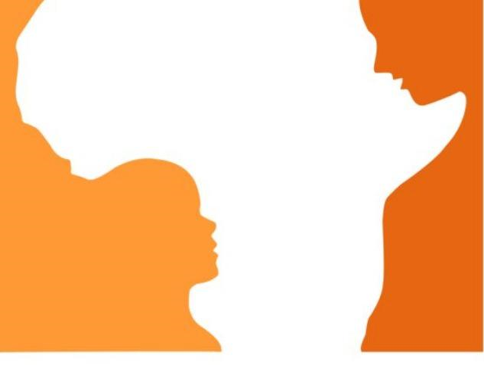
6. The principle of figure and ground
In any type of design, elements are either perceived as part of the background or the focal point in the foreground. The image is described as the focal point, and the background is where the image rests.
In this case, our brains will process smaller items included in the image as the ‘figure’ and the larger items as the ‘ground’ but will process the figure first.
The figure and ground object perception can be influenced by focus, color, and contrast. For example, in the image below, you’ll notice that our brains will process the white object first, then figure out the orange one. In the image, you see that it looks like the content of Africa at first, but after viewing it for a while, you’ll notice two faces staring at each other.
7. Common fate
Common fate wasn’t initially included in the Gestalt theory. However, in UX design, we can’t describe how useful common fate actually is. This principle states that people will always tend to group things that point to or are moving in the same direction.
For example, in this picture below, you’ll see many birds flying around. The background is white, so this image is mainly used as a vector, but since the birds are almost identical, our brain will tend to perceive them as a single stimulus.

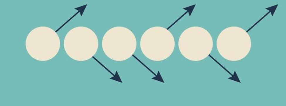
8. Synchrony
Synchrony is one of the most interesting Gestalt design principles and dictates that elements that move in the same direction will be perceived as more related to each other than those moving in opposite or different directions. Regardless of how they are placed, we will always see things that move in the same direction related to each other.
For example, in the image below, you’ll see that not all the circles are pointing upwards. Some of them are pointing downwards, but most viewers will associate them as similar together even though they aren’t physically grouped together.
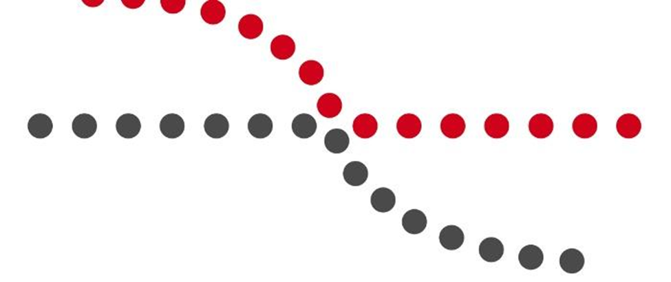
9. Continuity
According to the continuity principle, elements arranged in a curve or line are expected to continue beyond their endpoint. Short put, when our eyes follow a line or a curve, they believe the line will continue in the same direction until it encounters something along the way.
A perfect example is just like when you are looking at a road. The road will continually expand further than your eyes will see, but it doesn’t mean that the road will never end, does it? So instead, you keep assuming that it will continue along the same line you keep looking at.
For example, let’s take a look at the picture below. We are perceiving the image as a continuous movement and trying to minimize any interruptions and changes along the way. Here, we can perceive the image in two ways, one is the two lines overlapping, and the other is the red line and black line parting their ways while moving. In this case, it all comes down to perception.
Wrapping it up
That’s all for this article. These are the nine ways you can use Gestalt’s principles to help you enhance your site’s design or whatever you are trying to achieve with your consumers. Gestalt’s principles are important to analyze because they help you identify what perceptions a visitor would have when they visit your site or of an image you may post on social media or anywhere else.
Above all, we used example photos that you can observe to see how customers will react. No matter what you do, your priority should be improving how you design and attract new visitors. The key to great design is knowing how users will perceive your website or any image you are using. When you have this type of information, you are as powerful as ever!